Our Newly Redesigned HH Website – A Better Experience for You!
Current Events
|
Apr 7, 2021
|
4 MIN READ

Ever since COVID hit, I’ve developed a new guilty TV pleasure: HGTV design shows (my current favorite is Hometown). It’s so inspiring to see the thoughtfulness and care that’s put into taking a neglected space and restoring it to its potential or just seeing the difference that comes with a fresh coat of paint.
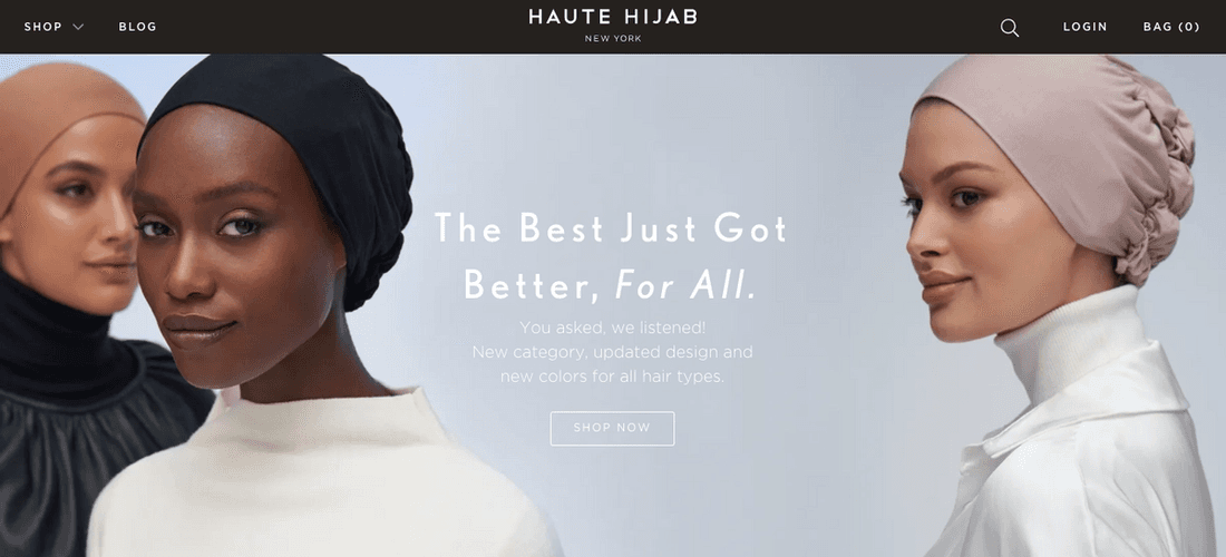
You may or may not have noticed that the Haute Hijab website recently got a renovation of its own! This month we launched a newly redesigned version of our online store.
As you might expect, this was a big project that required many hands on deck. As the Digital Product Manager at HH, my job is to help facilitate collaboration between teams and make sure things stay on track. Here, I’ll give you a behind-the-scenes look at how it all came together and what has been upgraded and added to make your experience even better!
When starting out any new project, be it a digital product or a physical one, the most important thing is to have a good understanding of what is needed and how it should work – at the most fundamental level, what problem(s) are we solving? There are lots of ways to answer this question. Many ideas come from the years I’ve worked at HH and how I’ve gotten to know our community and gained insight into what many of you want and need when shopping for hijabs.
I peruse the Facebook community group and customer service inbox for feedback. I get on the phone to chat with customers about what they’d like to see from us on the site. I brainstorm with members of the team about features and learn more about what they need for their work. I think about great online shopping experiences I’ve had as a customer and what made them so seamless. I look at our existing system and think about what works and what we could make better.
By thinking through the problems we’re solving from multiple angles and detailing what might be the ideal experience we want for our users, we get a much better sense of what are the most important functions and features to build right away, and how we might iterate on it and add new features later.

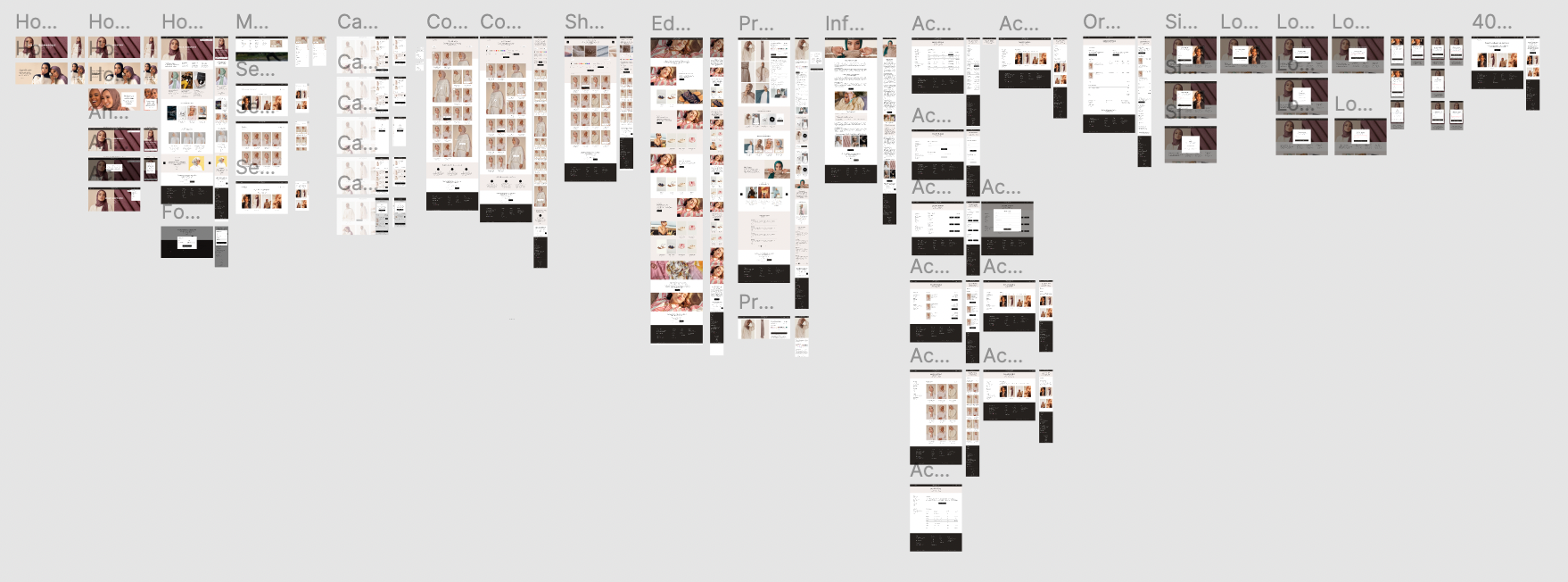
(Image: A macro view of the entire website as Erin sees it in the backend! Pretty impressive, right?
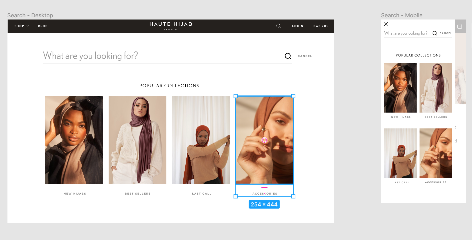
From there, it’s time to go to the drawing board, create designs that integrate the features we need and make sure we’ve thought through and documented how they’re meant to work. Next, it’s time to hand the designs over to engineers and developers with the technical expertise to create the data “foundation” and build the vision. Finally, it’s time to put those new designs to good use, filling in all the content that makes our site functional, informative and beautiful.
From there, it’s time to go to the drawing board, create designs that integrate the features we need and make sure we’ve thought through and documented how they’re meant to work. Next, it’s time to hand the designs over to engineers and developers with the technical expertise to create the data “foundation” and build the vision. Finally, it’s time to put those new designs to good use, filling in all the content that makes our site functional, informative and beautiful.
Sounds easy, right? :)
After more than a year of work (and many years of dreaming and brainstorming), we couldn’t be happier that our new website is finally here!
Here are some of the things you can look forward to:
1. Smoother navigation. Treating yourself or a loved one to a new hijab or accessory should be fun – it shouldn’t feel like work! We’ve made it easier to sort and filter products, updated our “Shop All” pages and reorganized our collections so that it’s easier to find what you need quickly. Viewing your account, navigating the website and editing your cart have all been made smoother.
2. More information where you need it. Especially if you’re new to HH or you’re new to hijab, it can be hard to figure out where to start or which fabrics are better for certain needs or occasions. We’ve added more information to lots of different places to help you quickly compare and discover the products that will make your life easier."
3. A fresh look and feel. We relished the opportunity to refresh our existing designs, sometimes starting from scratch and sometimes just adding a bit of “fresh paint” to features we already had. We put a lot of effort and care into creating inspiring imagery, from photography to graphic design to social media posts, and it was important to us to integrate more of that creative work into our website too.

This was a collaborative effort on the part of so many folks both on our team and outside. We collaborated with designer Rachouan on many of the designs, and I also took on a number of our designs in-house, with help from CEO Melanie and art director Nicole. Our COO Ahmed – a self-professed technology nerd – provided invaluable input on many of the new features and functions. Our senior engineer Yousef brought his technical savvy, company insights and many hours of work getting it built. We also partnered with a wonderful development agency, AskPhill, to lay the foundations and help us with the heavy lifting.
One of the most important things I personally learned throughout this process is simply that it is a process. I’ve always been inspired by Melanie and Ahmed’s dedication to ihsaan, to strive for excellence and do everything you do with beauty and integrity, and how this principle has remained at the core of our company as we grow. This requires you to shift your mindset away from rigid requirements and set end dates, because the truth is that you’re never done making things better.
One of the most important things I personally learned throughout this process is simply that it is a process. I’ve always been inspired by Melanie and Ahmed’s dedication to ihsaan, to strive for excellence and do everything you do with beauty and integrity, and how this principle has remained at the core of our company as we grow. This requires you to shift your mindset away from rigid requirements and set end dates, because the truth is that you’re never done making things better.
Our goal in everything we do at HH is to be constantly improving and innovating on what we have to offer because, quite simply, our community deserves the best. We have always been striving for this with our products, and now we have a fresh foundation to do even more with our digital experience too.
What do you think of the new website? What features would you like to see next? I always welcome your ideas and feedback at erin@hautehijab.com!
What do you think of the new website? What features would you like to see next? I always welcome your ideas and feedback at erin@hautehijab.com!
Subscribe to be the first to know about new product releases, styling ideas and more.
What products are you interested in?

